Friday, 22 March 2013

AS Media Technologies
What have you learnt about technologies from the process of constructing this product?
My technological knowledge has grew in the last 6 months an excessive amount. Predominantly in my Photoshop skills. I have used Photoshop CS5 in order to create all of my products throughout AS. I began Media knowing the basic information about photoshop and how to use tools on Photoshop for example like the lasso tool to cut objects out. I wasn't brilliant with this editing so after I had alot of practise through as media I have slowly improved. This is clear to see through my tasks I have completed throughout the year.

This is to show the tools that I have used and where they are situated in photoshop.

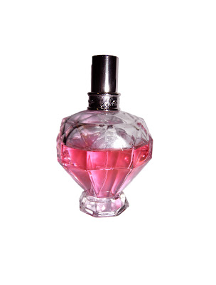
For example this is the bottle I first took images of to put into my preliminary task one; the perfume advertisement. This is a poor picture of the bottle as it is clear to see there is alot of dull light in the image. There is a block shadow running down the left hand side of the bottle and the content of the bottle is not bright enough for my liking. The light that is hitting the bottle from the flash is caught on the front of the bottle, shadowing either side of the bottle cap. I was then made aware of how to manipulate this in photoshop to produce a final piece that is suitable for a magazine advert.
I first uploaded the photo to photoshop, then duplicated the layer the image was on. This means there is two photographs of the same image available to edit in photoshop. If one image layer is turned on and the other is turned off it is easy to start again if a mistake is made. By slowly using the lasso tool I was able to select the image I want to remove from the background. After the image is selected by clicking around the object I clicked on the layer button, placed at the top of the screen, then new layer, layer via cut. This means the bottle is fully cut out of the background.
 The next step is to add a new file, you do this by clicking; file, new, a window will pop up on screen. The preset needs to be changed from Clipboard to International Paper. The setting with then automatically change and you can decide what size paper you would like to select to work on. By clicking on the first document I worked on I was then able to drag the image into my new blank document.
I made one more adjustment to the image by going to Image, Adjustments, Brightness and Contrast and darkening the brightness -4 and lightening the contrast +6.
This is the finished product on the left.
 This is another example of photo editing in photoshop. I applied the same process to the photograph but instead of layer via cutting, once the image is selected I went to Select on the top of the screen and Inverse. This means that the background is now selected instead of the model. I then went to Image, Adjustments, Brightness and Contrast and I lightened both the Brightness and Contrast by +7, i then found this wasn't bright enough in the background so lightened the contrast again by +14.
 My double page spread imagery was manipulated by using the clone tool, the blur tool and quick selection tool. These are all tools used to construct or change the image. In this case to make my image suitable to use in a DPS I need the jacket my model was wearing to continue in length. I applied the layer via cut technique to place the image on a white background. I then added contrast +6 and was ready to add the rest of the coat on. By slowly using the clone tool you are able to copy parts of the picture to other areas on the picture. I used the clone to to copy what already existed on the original image (on the left) to the bottom of the new page. This was fairly easy but to make it look more realistic I blurred the jacket after cloning it. The blurring tool is on the left hand side of the photoshop left third.
This is another example of my editing skills. You can see how I have lightened the image and used the quick fix tool, also allocated on the left hand side of the programme, to remove any spots or blemishes my model had. I also used the blur tool to soften my models hair and the clone tool to remove the little pieces of hair my model had sticking up out of her hood. The lightened image is more appropriate for my cover page image.

This is all my front cover drafts I did on photoshop to show how many attempts I did at making my front page just right. Using the tools I have already shown above.


My contents page attempts on photoshop.
The DPS attempts and publications I used in order to align my texts to the image.
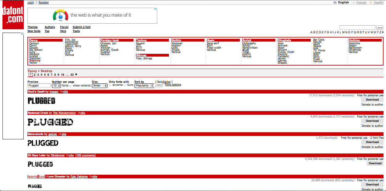
I began to learn how to manipulate text within photoshop by using secondary sources such as dafont.com. This is a site used so that you can type in the text you would like and look at designs you can use in your work.

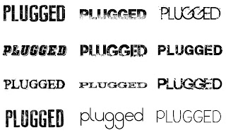 I chose my top favourite designs for my headline and took these into photoshop.
<-- My favourite texts.
I just copy and pasted these into photoshop and then used the technique I described earlier with using the lasso tool.
A quicker way to select these is using the magic wand tool, placed above the lasso tool. This selects anything you click straight away and selects everything similar, using this tool to select the white background and clicking delete eliminates all the colour; leaving just the text. I can then drag the layer into any photoshop document I have open, i then selected the text and painted over it in black and red with the brush tool to get a finished product like this.

My technological knowledge has grew in the last 6 months an excessive amount. Predominantly in my Photoshop skills. I have used Photoshop CS5 in order to create all of my products throughout AS. I began Media knowing the basic information about photoshop and how to use tools on Photoshop for example like the lasso tool to cut objects out. I wasn't brilliant with this editing so after I had alot of practise through as media I have slowly improved. This is clear to see through my tasks I have completed throughout the year.

This is to show the tools that I have used and where they are situated in photoshop.

For example this is the bottle I first took images of to put into my preliminary task one; the perfume advertisement. This is a poor picture of the bottle as it is clear to see there is alot of dull light in the image. There is a block shadow running down the left hand side of the bottle and the content of the bottle is not bright enough for my liking. The light that is hitting the bottle from the flash is caught on the front of the bottle, shadowing either side of the bottle cap. I was then made aware of how to manipulate this in photoshop to produce a final piece that is suitable for a magazine advert.
I first uploaded the photo to photoshop, then duplicated the layer the image was on. This means there is two photographs of the same image available to edit in photoshop. If one image layer is turned on and the other is turned off it is easy to start again if a mistake is made. By slowly using the lasso tool I was able to select the image I want to remove from the background. After the image is selected by clicking around the object I clicked on the layer button, placed at the top of the screen, then new layer, layer via cut. This means the bottle is fully cut out of the background.
 The next step is to add a new file, you do this by clicking; file, new, a window will pop up on screen. The preset needs to be changed from Clipboard to International Paper. The setting with then automatically change and you can decide what size paper you would like to select to work on. By clicking on the first document I worked on I was then able to drag the image into my new blank document.
 I made one more adjustment to the image by going to Image, Adjustments, Brightness and Contrast and darkening the brightness -4 and lightening the contrast +6.
This is the finished product on the left.


This is another example of my editing skills. You can see how I have lightened the image and used the quick fix tool, also allocated on the left hand side of the programme, to remove any spots or blemishes my model had. I also used the blur tool to soften my models hair and the clone tool to remove the little pieces of hair my model had sticking up out of her hood. The lightened image is more appropriate for my cover page image.


This is all my front cover drafts I did on photoshop to show how many attempts I did at making my front page just right. Using the tools I have already shown above.


My contents page attempts on photoshop.
The DPS attempts and publications I used in order to align my texts to the image.
I began to learn how to manipulate text within photoshop by using secondary sources such as dafont.com. This is a site used so that you can type in the text you would like and look at designs you can use in your work.
 I chose my top favourite designs for my headline and took these into photoshop.
 <-- My favourite texts.
I just copy and pasted these into photoshop and then used the technique I described earlier with using the lasso tool.
A quicker way to select these is using the magic wand tool, placed above the lasso tool. This selects anything you click straight away and selects everything similar, using this tool to select the white background and clicking delete eliminates all the colour; leaving just the text. I can then drag the layer into any photoshop document I have open, i then selected the text and painted over it in black and red with the brush tool to get a finished product like this.

Other texts I tried using are here:


AS Media Progression
Looking back at your preliminary task, what do you feel you have learnt in the progression from it to the full product?

In the process of making my preliminary task I was aware of the basic techniques of photoshopping such as using the level tool to add contrast and adjust the white balance of the images. I also knew how to use the lasso tool and quick selection tool in order to cut an object out and place it on top of another image. This became very useful for the fact we had to cut out a perfume bottle of our choice if we didn’t place the bottle in the original images. I didn’t know how to add text, blend images, manipulate the skin, manipulate text; they were all things I newly learnt at college through the making of my three objects. I have learnt a great deal about the making of magazine and advert production since September 2012, I think it’s clear to see I have developed in my skills in order to make a good standard of work in media studies. The text has developed in style as I have learnt how to transfer text from secondary sources and manipulate them in Photoshop using the quick selection tool and the clone stamp tool, for example; you can see how I have applied more appropriate text in my third image (my music magazine) than in my first (perfume ad). This is clear as the text is just placed within the image where I thought looked best or wouldn’t overlap my image however as I have progressed I found that it doesn’t matter if the text and imagery is overlapping the image at all and if it’s conventional then it works well.
If I were to create the preliminary task again I would make sure the alignment of the background was correct for my model. This makes a big difference for example the water feature can’t be seen behind my model, yet this was a key aspect of my statement; being individual. You can look glamorous and casual at the same time. Although the cutting of the bottle is demonstration of my skills I would of put the bottle within the actual image to make sure I have positioned it properly. The text in my eyes is where I needed to improve most however I only know that now as I have developed my skills. In feedback from my tutor I found that it looked as if my text hadn’t had much thought about the positioning, although it had. I would of experimented with different fonts and positions more before confirming them if I had to do this again. Although the image alignment was out abit I think that the costume of my model was good, and worked well with my theme. These are the two things I was confident about when taking my imagery, the photography and the costume. I knew if I was to make more projects in media these are things that I would think about carefully.
It was useful to carry out the preliminary task because it gave us a taster of what we could do, pushing our skills to the maximum. The tutors then knew exactly what we needed to do in order to improve our skills ready for the next project. I found that getting feedback from the preliminary task was a bit disheartening however it was what I needed to motivate myself to do better in the next task.
My previous feedback from preliminary task:
http://www.educreations.com/lesson/view/lauren-mabbett-induction-task/1759483/?ref=link

The second attempt at a project, my college magazine has shown improvements such as I copied via cut on my models hair and lowered the opacity in order to see my title a lot better. This is a technique I have learnt in the progression. Before I learnt to import text I was able to learn to manipulate it abit by changing the position of the coverline, in this case, for example bend my writing into an arch.
Masthead title piece The magazine's title. Usually displayed in the top left corner.
Price Magazine cost.
Date Weekly: usually from Saturday to Friday. Monthly: a month ahead.
Issue Number A tally of magazines.
Barcode Read electronically and decoded into usable information.
Teaser One word/phrase acts as an attention grabber.
Headline A phrase that may summarize the main point on the main feature. In large print, different style, bold colours in order to catch the attention of the reader.
Subtitle Smaller headline that may summarize the feature.
Smaller Feature Features included in the magazine.
Images Size CU to med CU. Ranges from the main image to x amount featuring one main image and smaller images. Helps make the page look more interesting. It can add understanding of a story and/or entice someone to read the magazine.
Font Style and size of a type face.
Colour Specific/stylistic/thematic types.
Graphics Graphical shapes to highlight feature(s)
Offers/adverts blurb Banner Style shape featuring free products/promotions.
Sell Lines Small text that sells the title.
Left Third The left side of the magazine that holds headlines.
Splash Graphics that resemble words.
Credit Credit given to the people that have worked on the magazine ( such as the photographer )
Kicker This Leads you in to the teller by using catchy words.
Teller A short box of information about the subject.
Skyline Headline above master headline.
Flash Graphics that resemble words.
Graphology The art of using graphics.
Anchorage Putting captions on photos to explain the image.
Colour Scheme Colours presented in the magazine.
Vocabulary Information relevant to the magazine.
Screamers Using things such as '!' to create emphasis.
In conclusion I have learnt things such as how to apply the right conventions, produce a correct photo layout, add things to add emphasis to my work. Add and manipulate text in Photoshop to create a more professional looking piece. I learnt about how social media is now interpreted into magazine and technology today. I have become aware of where to put things such as the barcode and coverlines. These are all things that I have learnt over the passed 6 months.
In conclusion I have learnt things such as how to apply the right conventions, produce a correct photo layout, add things to add emphasis to my work. Add and manipulate text in Photoshop to create a more professional looking piece. I learnt about how social media is now interpreted into magazine and technology today. I have become aware of where to put things such as the barcode and coverlines. These are all things that I have learnt over the passed 6 months.
Thursday, 21 March 2013
How does your media product represent particular social groups? Prezi.com
How does your media product represent particular social groups?
Friday, 1 March 2013


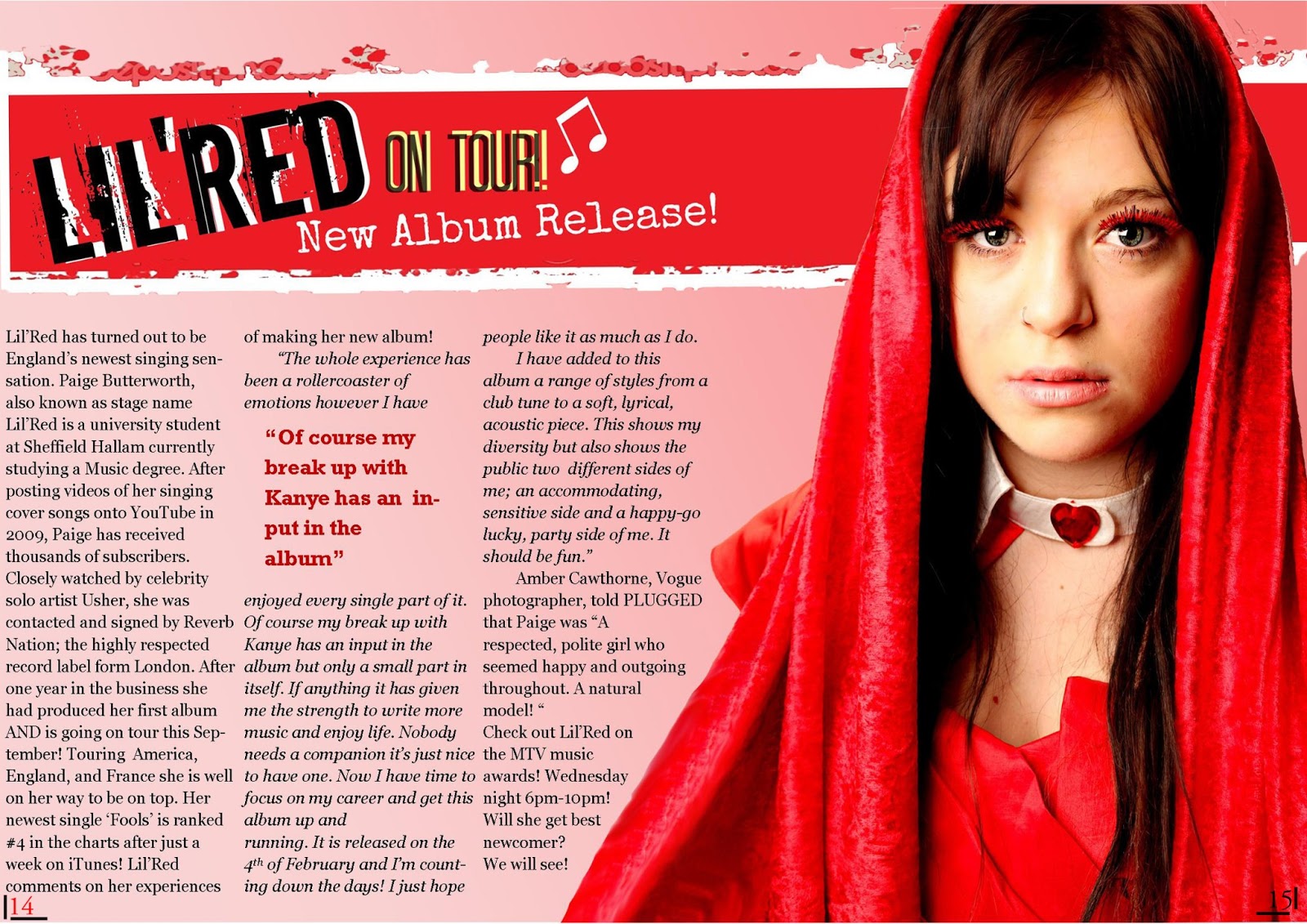
Double Page Spread Draft 1
The first draft I produced was inspired by DPS examples on google;
https://www.google.co.uk/search?hl=en&site=&source=hp&q=double+page+spread+music+magazine&oq=double+page+spread+m&gs_l=hp.3.2.0l8j0i30l2.912.7435.0.10410.20.12.0.8.8.0.567.1342.10j1j5-1.12.0.les%3B..0.0...1c.1.5.hp.qHUnP60MwBE

Double Page Spread Draft 2

Double Page Spread Draft 3
Subscribe to:
Posts (Atom)